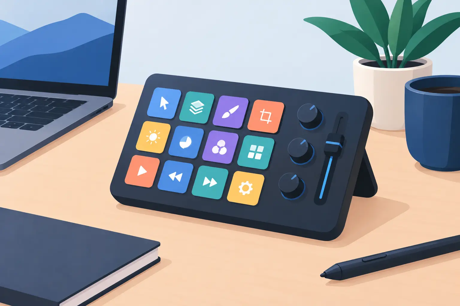
A designer workflow control pad should not demand more desk space, more cables, or another learning curve. It should remove friction at the exact point where creative work slows down: the moment your hand leaves the mouse, your eyes leave the canvas, and your focus breaks.
Design work is full of small actions that add up. Zooming. Switching tools. Grouping layers. Toggling guides. Starting a preview. Nudging a timeline. None is difficult. Reaching for a keyboard shortcut, a macro pad, or a second control device hundreds of times a day is where the drag begins.
The best control surface is not necessarily the one with the most buttons. It is the one that keeps command close without turning your desk into a cockpit.
Why designers need control closer to the mouse
A designer already works inside a dense input system. Mouse, keyboard, pen tablet, monitor, audio controls, phone, reference device. Each peripheral earns its place only if it saves more attention than it consumes.
Traditional macro pads can be fast, but they create a physical detour. You look down, move away from the mouse, find the key, then return to the work. Stream controls can be useful for live work, but they often add visual noise to a desk that is already managing cables, chargers, hard drives, and color-critical tools.
A designer workflow control pad takes a different approach. It places programmable actions beneath or beside the area where your mouse already lives. The surface becomes part of the workflow instead of another object competing for space.
That change sounds small. In practice, it affects rhythm. Your dominant hand stays positioned. Your non-dominant hand can remain on the keyboard or pen tablet. The action happens without a reach, a glance, or a pause long enough to lose the thought you were shaping.
The goal is less interface, not more
There is a trap in creative gear: treating more controls as automatically better. A large grid of labeled buttons can feel powerful at first, then become one more system to maintain. Profiles multiply. Icons need updating. Muscle memory gets diluted across too many surfaces.
A better setup starts with a narrower question: which actions interrupt your work most often?
For a brand designer, that might be paste-in-place, outline stroke, toggle grid, export, and undo. For a video editor, it may be play, cut, marker, ripple delete, and full-screen preview. For a 3D artist, it could be viewport modes, snapping, frame selection, render preview, and transform tools.
The point is not to map every command. It is to reserve immediate access for actions that repeatedly pull you out of flow.
Build around repetition, not novelty
The first commands you assign should be boring. That is a feature.
Choose the actions you perform so often that you stop noticing them: a tool switch, a view change, a transport control, a frequently used macro. These are the commands with the greatest return because they cut the same small interruption over and over again.
Then test the layout for a week. If a zone requires thought, move it or replace it. A workflow control pad is not a shrine to your shortcut knowledge. It is a working map of your real habits.
One surface, different modes
Creative work rarely stays in one application. A designer may move from Figma to Photoshop, Premiere Pro, Blender, a browser, Slack, and a music player before lunch. Fixed hardware becomes less useful when its labels only make sense in one program.
Mode switching solves that, provided it stays simple. One mode for design. One for editing. One for review or calls. Each can use the same physical positions while changing the commands underneath.
This is where an invisible control surface has an advantage. It does not force every function to be visible at all times. The desk remains calm while the system changes beneath the surface.
A 4 by 4 grid, for example, gives 16 distinct pressure zones without adding 16 physical keys. That is enough room for a focused set of commands in each mode. It also encourages discipline. You prioritize what matters instead of creating a panel full of rarely used functions.
Pressure control changes the interaction
Buttons are binary. Pressed or not pressed. Pressure-sensitive zones can create a more deliberate relationship with control, especially when accidental triggers would be costly.
For designers, this can be useful near a mouse area where the hand rests naturally. A light contact should not fire an action. A purposeful press should. The difference protects the everyday function of the desk mat while making the controls available on demand.
Sensitivity needs careful tuning. Set it too low and the surface becomes noisy. Set it too high and the benefit of fast access disappears. The right threshold feels intentional: close enough to activate without reaching, firm enough to avoid mistakes.
That balance matters more than flashy features. A control pad should fade into muscle memory, not ask for attention every time you use it.
A cleaner desk is a faster desk
Minimalism is not only an aesthetic decision. It is operational.
Every separate device brings a footprint, a cable, a charging requirement, a software utility, or all four. That overhead is easy to ignore until the desk feels crowded and the workflow begins to feel fragmented. A clean setup reduces the number of places your hands and eyes must travel.
This is the central idea behind KAGE GhostPad: make the mousepad itself an active control interface. Invisible pressure zones turn unused surface area into shortcuts, macros, media controls, and application actions. No extra keypad parked beside the keyboard. No bright display competing with the work on screen.
The product approach also makes sense for users who care about setup flexibility. Browser-based configuration and plug-and-play behavior reduce the usual peripheral tax of installs, background apps, and system clutter. For a designer moving between a studio desktop, a home workstation, and a laptop dock, fewer dependencies matter.
Where a workflow control pad fits best
A designer workflow control pad is strongest when it complements the tools you already rely on. It is not a replacement for a full keyboard, a pen tablet, or a specialized editing console when your job demands tactile jog wheels and precise transport controls.
It works best as the fast-access layer between mouse and keyboard.
For UI and product design, map common selection, alignment, preview, and prototype actions. For photo work, use it for ratings, zoom levels, brush changes, before-and-after views, and exports. For motion design and video, place playback, markers, cuts, and timeline navigation where they can be reached without breaking cursor control.
Developers can apply the same logic to build commands, terminal actions, window management, push-to-talk, and media controls. Streamers can create a compact live mode for scene changes, mute, clips, and chat actions. The surface does not care what kind of work you do. The value comes from reducing the distance between intention and execution.
Set it up like a system
Start with one application and five high-frequency actions. Use those assignments until they become automatic. Add more only when you can name a specific interruption they will remove.
Keep similar actions in consistent locations across modes. Put playback controls in the same row for editing, streaming, and music. Keep navigation on one side. Reserve a corner for a safe utility command such as mute or undo. Consistency creates speed.
Also leave space for change. Your workflow will evolve with new projects, software updates, and client demands. A configurable control surface should adapt with it. The hardware stays familiar while the command layer keeps pace.
The most effective desk tools do not make a performance out of being advanced. They remove the awkward reach, the spare cable, and the repeated interruption. Put your most-used commands where your hand already rests, then let the work hold your attention.
Leave a Reply