
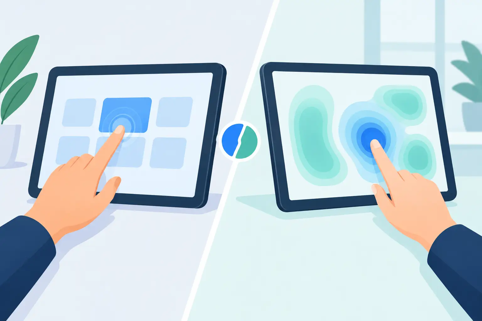
A control surface should not force you to look away from the work. That is the real divide in touch panels vs pressure zones. Both can trigger shortcuts, macros, media commands, and game actions. But they ask different things of your hands, your attention, and your desk.
Touch panels put controls in plain sight. Pressure zones put them where your hand already rests. For a gamer holding an angle, an editor cutting a sequence, or a developer deep in a build, that difference is not cosmetic. It changes the rhythm of the task.
Touch Panels vs Pressure Zones: The Core Difference
A touch panel detects contact across a visible or defined surface. It may use capacitive sensing, like a phone screen or trackpad, and it often relies on tap, swipe, or gesture input. The interaction is direct: touch the control, receive the command.
Pressure zones detect force. A light press, firmer hold, or intentional push can activate a mapped action. On a smart desk mat, those zones can sit beneath the surface rather than appearing as buttons, screens, or labeled tiles.
The distinction sounds technical. In use, it is physical.
A touch panel usually asks you to move to a control and confirm its location with your eyes or fingertips. A pressure zone can be placed in the natural orbit of the mouse hand. The command is available without adding another object to the desk or another visual system to monitor.
Neither method wins in every setup. The right choice depends on whether you need visible context or invisible speed.
When Touch Panels Make Sense
Touch panels are useful when the controls change often or when each command needs clear visual labeling. A streaming layout with scene names, audio levels, chat controls, and camera states benefits from a display or an obvious grid. If a command is rare, complex, or easy to confuse with another command, seeing it before you trigger it can prevent mistakes.
They also work well for gesture-led interaction. Scrubbing a timeline, zooming a canvas, panning a map, or adjusting a virtual fader can feel natural on a touch surface. The control itself is the interface, not just a trigger.
That visibility comes with a cost. A touch panel adds a destination for your hand and eyes. It occupies desk space. It may need charging, software, profiles, cable management, or a permanent place in your setup. None of these are deal-breakers. For many creators, a dedicated control pad is exactly right. But it is another device competing for room and attention.
Touch input can also be ambiguous during fast work. Resting a finger, brushing a surface, or reaching across a desk can create unintended contact unless the panel is carefully designed. Good touch hardware solves much of this with activation rules and software logic, but accidental input remains part of the design problem.
Why Pressure Zones Change the Desk
Pressure zones are strongest when the command is frequent, simple, and time-sensitive. Think push-to-talk, mute, play and pause, a weapon action, a brush toggle, undo, marker placement, or a custom macro. These are commands you want close, fast, and repeatable.
The key advantage is position. Your hand does not need to leave its primary tool. Your mouse hand stays near the mouse. Your eyes stay on the game, edit, codebase, or live production. The control exists beneath the same surface you use all day.
That is a different approach to desktop hardware. Instead of building a bigger command center, it turns an existing object into one.
A 4 by 4 pressure grid, for example, creates 16 programmable zones without 16 visible buttons. The surface remains a mousepad first. The control system stays quiet until you need it. KAGE GhostPad is built around this principle: a pressure-sensitive desk surface that brings programmable actions into the mousepad rather than adding another panel beside it.
For clean setups, the appeal is immediate. Fewer devices mean fewer cables, fewer light sources, and fewer objects breaking the line of the desk. More importantly, fewer devices can mean fewer interruptions.
Speed Is Not Just About Milliseconds
It is tempting to compare input methods only by activation time. How quickly does the sensor register a tap or press? That matters, especially in competitive games and live production. But the larger speed gain often comes before the signal reaches the computer.
Every time you reach for a separate device, you make a small transition. Move your hand. Find the target. Confirm the control. Return to the mouse or keyboard. One transition is trivial. Repeat it hundreds of times in a session and it becomes drag.
Pressure zones reduce that travel. They can make common actions part of the hand position you already use. That does not make them universally faster. If you need to identify one command from 30 changing options, a labeled touch panel may be faster because the information is visible. But when the command is muscle memory, invisible input has an edge.
The best controls eventually disappear from conscious thought. You press, the system responds, and your attention stays on the outcome.
The Trade-Off: Discovery vs Muscle Memory
A visible touch panel is easier to learn. You can label buttons, organize pages, use icons, and change layouts for different apps. A new user can look at it and understand what to do.
Pressure zones demand a short learning period. Without visible labels, placement matters. The best mappings follow a spatial logic: media controls along one edge, communication commands in a corner, creative shortcuts near the hand’s resting zone. Repetition turns that layout into muscle memory.
This makes pressure zones less suited to controls you rarely use. Putting a once-a-month command under a desk mat is not a meaningful advantage. It also means configuration deserves care. A random collection of macros will feel random, no matter how advanced the sensor is.
Use pressure zones for the actions that interrupt you most. Keep visible controls for settings, changing states, and commands that need explanation. A hybrid setup can be the right answer. Invisible controls for immediate actions. A touch display or keyboard layer for the long tail of options.
Accidental Input Is a Design Question
A desk surface receives constant contact. A wrist shifts. A mouse lands. A hand rests. Any pressure-zone system has to separate intentional presses from normal use.
That is why sensitivity, zone placement, and activation thresholds matter more than marketing language. A zone should respond when you mean it, not when you set down a coffee mug or reposition your grip. Some users will prefer firmer activation for gaming. Others may want a lighter press for editing or accessibility. The system should leave room for both.
Mode switching also matters. A layout for a first-person shooter should not behave like a layout for video editing. A smart surface becomes more useful when the same physical zones can change purpose by mode, while the placement remains familiar.
The goal is not to make every inch of the desk interactive. The goal is to make selected actions available without friction.
Which Interface Fits Your Workflow?
Choose a touch panel when visual feedback is central to the task. Stream scene selection, audio mixing, app-specific menus, and gesture controls benefit from visible labels and adaptable screens. You are operating a control board, and you need to see the board.
Choose pressure zones when you want repeatable commands at hand level. They are built for actions that should feel immediate: mute a mic, trigger push-to-talk, run a macro, toggle a tool, mark a moment, or fire a game command. You are not looking for another display. You are looking for less movement.
For creators and power users, the question is not whether one technology is more advanced. The question is where friction lives in your current setup. If the problem is too many options, use a visible interface. If the problem is too many reaches, pressure zones are the more direct system.
Your desk does not need more hardware to do more. It may simply need one familiar surface that finally understands the work happening above it.
Leave a Reply